... some other goodies (well, that may not be the right word) to follow.
As was implied in my diary from earlier this week, the June 2012 Arctic sea ice report from the National Snow and Ice Data Center (NSIDC) showed a number of rather disturbing trends, which I'll show you below. Also, I'll write a little bit about the current heat wave and how it compares with historic heat waves of the past, with the help of an analysis technique that is pretty amazing to those of us in the meteorology/climatology business.
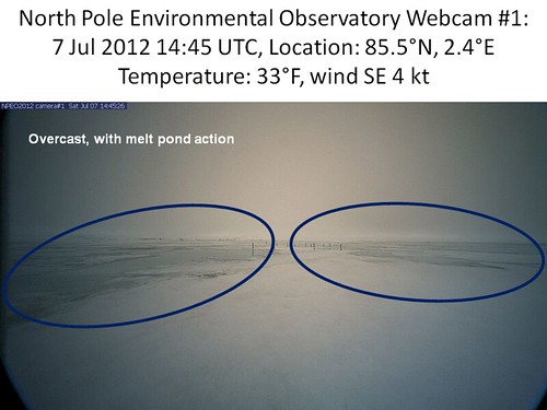
As far as a visual of the North Pole (or something close to it) goes, the NOAA webcams continue to be at work. The image below was capture at 14:45 Universal Time (Greenwich Mean Time for you old-fashioned folks) on 7 July 2012. Note the increased prevalence of melt ponds (highlighted with blue ovals). Temperature at this time was 33°F.
More below.
JUNE 2012 ARCTIC SEA ICE
Mean June 2012 Arctic sea ice extent was the 2nd lowest in the satellite record (beginning 1979). Before I show the ice graphics, though, let's look at the June 2012 mean climate and how it might explain the rapid decrease in the ice extent.
June 2012 Arctic weather
First is the sea level pressure difference from normal for the month. I've drawn in the anomalously high (labelled with "H") and low (labelled with "L") pressure areas over the region (plotted north of 50°N). The direction of the approximate wind anomalies are labeled with arrows.
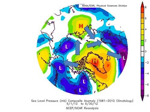
The winds are pushing more than normal amounts of Arctic sea ice out of the Arctic Ocean basin into the Norwegian Sea and north Atlantic, where it then melts. On the other side of the Arctic Ocean poleward of western North American and Siberia, the winds tended to spread out the ice a bit.
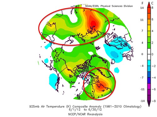
Temperatures were above normal almost everywhere that lost large amounts of sea ice, especially near the Kara Sea (north of central Siberia) and Baffin Bay. The Bering Sea and nearby regions that also lost significant sea ice area also were above normal, but to a lesser extent. The graphic below shows those temperatures at about 3,000 feet above ground poleward of 50°N.
June 2012 Arctic sea ice extent in context
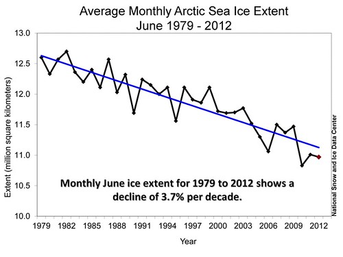
As to June 2012 sea ice .... below is the time series of June Arctic sea ice extent from 1979 to present. The linear trend is -3.7% per decade; the last three Junes have been especially low, and below the linear trend.
During mid-month, the 5-day running mean Arctic sea ice extent broke the minimum area coverage for several days running, as can be seen below.
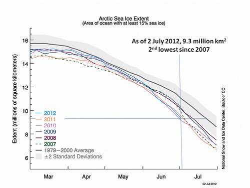
Since 2 July, Arctic sea ice has continued to decrease at about 100,000 km2 per day. The approximate area coverage on 7 July 2012 was 8.8 million km2.

There's some evidence of a small slowdown in sea ice extent decline over the past two or three days. (NOTE: Just looked at 9 July 2012 graphic and it looks like I might have been wrong in this last statement! :-( )
The mean monthly Arctic sea ice extent graphic for June 2012 is next. I've circled the areas that saw the most significant losses during the month. Note that they coincide with those areas with above normal temperatures.
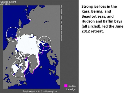
Which came first, the temperatures or the ice loss? Probably a feedback meaning both are important in the grand scheme of things. Warm temperatures = melting ice. No ice where there used to be ice = more absorbed solar radiation by water and warmer sea surface temperatures = warmer air temperatures. It all fits together in a positive feedback loop, unless there's something, like more cloudiness than normal, to interrupt the cycle.
June 2012 Arctic sea ice volume in context
While area tells us the coverage of higher albedo sea ice, the volume of ice in the Arctic is the most important value to estimate, since that tells us the amount of ice that remains to be melted. Think about how much more slowly ice melts in a glass with thick ice cubes, versus one with thin cubes of ice covering the same area at the top of the glass, and you'll get the picture.
How do we estimate the volume of Arctic sea ice? With (gasp!) computer models of sea ice! The Pan-Arctic Ice Ocean Modeling and Assimilation System (PIOMAS) is such a model. It estimates Arctic sea ice volume based on analyzed weather conditions, including
- Temperature,
- snow cover,
- wind,
- ice surface energy balance,
- estimated sea water temperatures beneath the ice, and
- sea surface temperatures where the ocean is ice-free.
Any actual sea ice thickness data, from either remote sensing or more direct observation methods, are also assimilated to adjust the model toward these values.
PIOMAS was updated through June 30, 2012 by the University of Washington's
Polar Science Center last week. The time series of Arctic sea ice volume anomalies from the beginning of the satellite record of Arctic sea ice extent to present is shown below. I've added an 'eyeballed' recent non-linear sea ice trend to the graphic, which already contains a linear trend in the sea ice volume anomalies (difference from the 1979-2011 mean volume).
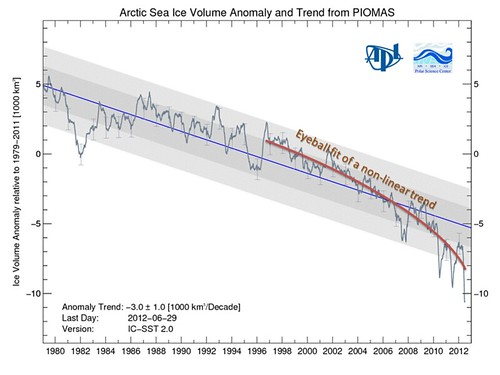
The eyeballed non-linear trend shows increasing rates of decline, consistent with the same or increasingly large amounts of warm season energy being available to melt a steadily decreasing volume of ice (again, think of the ice-in-a-glass analogy above).
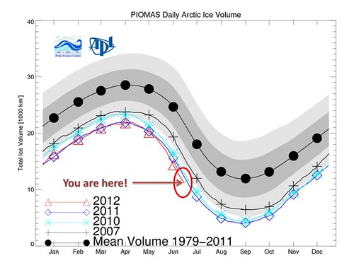
The mean 1979-2008 sea ice volume seasonal cycle (dark thick contour, with ±1 and 2 standard deviations darkly and lightly shaded, respectively), with 2007, 2010, and 2011 seasonal cycles in full, and 2012 through 30 June only, is shown next. The points on each line represent mid-month for each calendar month on the x-axis. Each year has its own color, as per the legend in the lower left. This year's volumes since early May have been lower than in the previous five years, and are likely lower than any year in the satellite record.
Poor person's Arctic sea ice thickness estimate
Neven on his very comprehensive Arctic sea ice blog goes one better, and does a poor person's estimate of the mean thickness of the Arctic sea ice based on the Arctic sea ice area (not extent, but actual area covered with sea ice) calculated by the University of Illinois Urbana-Champaign Polar Research Group, and the PIOMAS sea ice volume. Dividing the volume (m3) by the area covered with ice (m2) gives a length (m) or thickness. Neven's results are shown below for 2005 through 2011 for the year, and ending 30 June for 2012.

There are some very interesting patterns that appear in the annual cycle of mean sea ice thickness in this graphic. One thing appears to be counter-intuitive; the mean thickness is largest late in the summer in the early years. This can be explained through thinking about what age sea ice is gone, and what age sea ice is left at the end of the melt season. In earlier years (2005-2008), there was more (and thicker) multiyear ice to increase the average as the ice melted, and the maximum occurs in July or August. In the last three years, this estimated mean thickness maximum occured in late May to June, as the reduced amount (and thinner) multiyear ice added less to the average. It may also be that the multiyear ice was (and now is) melting more and is thinner than in previous years to begin with. The transition year from August to June maximum mean thickness appears to be 2009 (the dark green time series trace), with 2010, 2011, and so far, 2012 behaving similarly.
The minimum thickness, on the other hand, shows no change in timing. It has shown, as one might expect, about a 40-50% decline since 2005, with sharpest declines between 2006 and 2007 and 2009 and 2010.
May-June continental snow cover in sharp decline
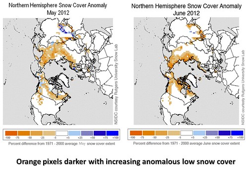
Along with the decreasing sea ice, we have had decreasing snow cover in the spring and early summer. This has allowed the Siberian, North American, and European land masses bordering the Arctic Ocean to warm more than in previous years. The snow cover departures from normal for May (left) and June (right) 2012 are shown below. The deeper the orange color, the more anomalously low the snow cover is in each box. The deeper blues indicate more anomalous high snow cover. To summarize, there isn't very much blue, and a great deal of orange! (the great orange Satan?!?!?)
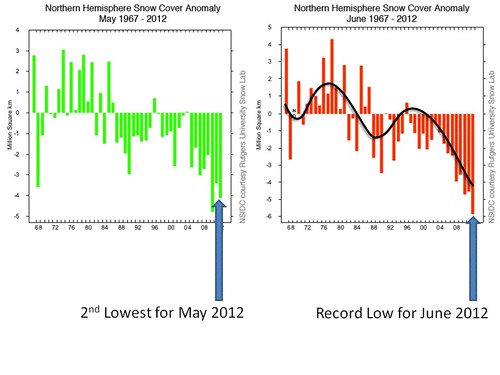
The time series of May and June snow cover from the beginning of snow cover observations by satellite (1967) to 2012 is shown on the left and right below, respectively. These are, to me, no less alarming than the Arctic sea ice volume graphics. Especially in June, there is a recent accelerating loss of land snow cover to which I have fit a rough curve.
The loss of snow and ice is a positive feedback in the global warming scenario.
All of this is consistent with the warming that has been observed, and how it's been amplified in the polar regions, where the amount of reflection of sunlight by snow and ice is so important.
What happens next?
As I've said often in these diaries, that depends on short-term climate in the Arctic. High pressure, above normal temperatures, and favorable winds (i.e. that force ice out of the Arctic Ocean basin, and/or push the ice together), will result in smaller sea ice extent, particularly if the ice leaving the Arctic rapidly melts. Beyond about one-to-two weeks, there's no accurate forecast that can be made using weather forecast models. I've not checked the climate model run by the National Centers for Environmental Prediction (U.S.), which has ocean and ice that interacts with the forecast atmosphere; I may take a look at that for my next posting.
Stay tuned!
THE BONUS: 2010 and 2011 versus 1934 and 1936 heat waves
The Dust Bowl 1930s
The 1930s were infamous for continental heat waves, just as recent years have become. The worst of the years were 1934 and 1936, for both extent and intensity. A number of city and state heat records were set, particularly in 1936 in the Great Plains, that still stand (mostly) today. This begs for a comparison between current years with significantly hot summers and those from the Dust Bowl days 75-80 years ago.
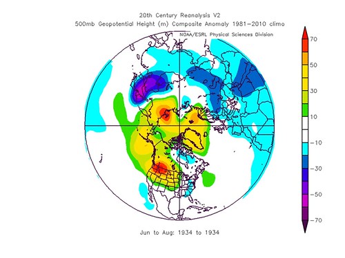
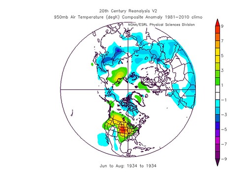
A comprehensive comparison was not possible until recently, when a method to determine what the most likely 3-dimensional (surface and aloft) atmospheric conditions would have to be for the observed temperature, winds, and sea level pressure to have occurred. This is called The 20th Century Reanalysis (Version 2), and it was developed by the NOAA Earth Systems Research Lab.
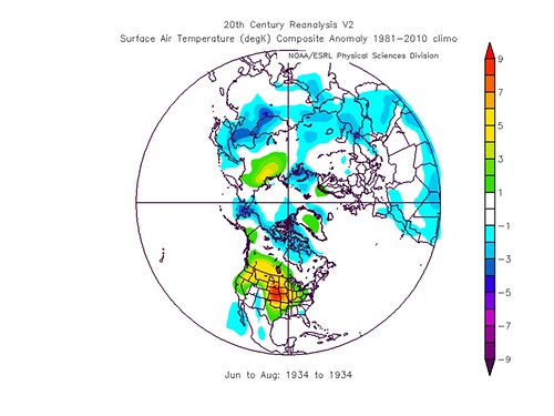
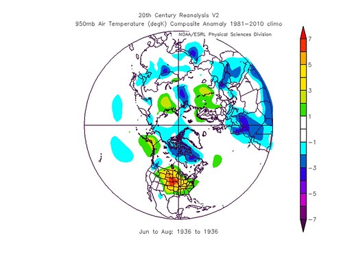
The following graphics are from this data set. They show the differences or anomalies from the (most recent) 1981 to 2010 30-year climatology, in the mid-troposphere (500-hPa or millibar) height field, 950-hPa and 2-meter (what we experience at the ground) air temperature fields. The 950-hPa and 2-meter temperature departures from climatology look almost identical in both 1934 and 1936. It was very hot over central North America, with anomalies approaching 8°C (14°F) for the three months.
| 1934 |
anomaly graphics |
| 500-mb height |
 |
| 950-mb temp. anom. |
 |
| surface air temp. |
 |
| 1936 |
anomaly graphics |
| 500-mb height |
 |
| 950-mb temp. anom. |
 |
| surface air temp. |
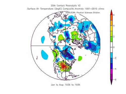 |
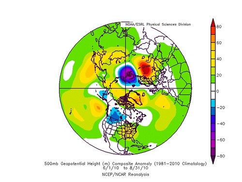
But notice that the positive (warm) departures from climatology during the 1930s seem to be balanced out if you look at the entire northern hemisphere. The Arctic was NOT warm in those summers. Also the 500-hPa (mid-tropospheric) heights for 1936, look to be below the 1981-2010 climatological mean averaged over the entire northern hemisphere. That means for that year, the average Northern Hemisphere temperature from 500-hPa (about 20,000 feet) to the surface was
below the 1981-2010 average.
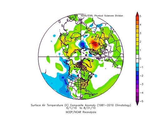
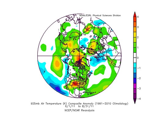
Summer 2010 and 2011
If we examine the same variables for the 2010 and 2011 summers, both of which had notable hot aspects, we see the following:
- Mid-troposphere height anomalies look higher on average over the full hemisphere for both recent summers than in the 1930s summers. This means that the atmosphere below about 20,000 feet is warmer now than it was back then, averaged over the full hemisphere.
- Warmer-than-normal temperatures are more widespread in the lower troposphere and near-surface in 2010 and 2011 than in the 1930s. This is consistent with the higher mid-tropospheric heights.
| 2010 |
anomaly graphics |
| 500-mb height |
 |
| 925-mb temp. anom. |
 |
| surface air temp. |
 |
| 2011 |
anomaly graphics |
| 500-mb height |
 |
| 950-mb temp. anom. |
 |
| surface air temp. |
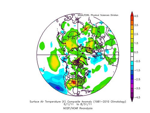 |
In 2010, the hot temperatures in European Russia are prominent (anomalies exceeding 5°C or 9°F). In 2011, anomalies of the same order appear in the southern U.S. Great Plains.
